

Products · Build a dot
Views
Write a page's markup, show its state, handle taps and typing, repeat and hide content, and lay it all out with props.
A page's view lives in view.dml. It looks like HTML, built from Dot's components, and shows the page's state.
<View>
  <Text variant="title">Hello, {{ name }}</Text>
  <View variant="card" direction="row" justify="between" align="center">
    <Text>{{ count }} {{ count === 1 ? 'tap' : 'taps' }}</Text>
    <Button onClick="increment" disabled="{{ count >= 5 }}">Add one</Button>
  </View>
</View>
The build checks every name in it and points at the line when something's off.
One root View
Wrap the whole page in one <View>. It fills the screen with roomy padding. For an edge-to-edge banner, use <View padding="none">.
Text goes inside <Text>. A few components, like Button and Badge, take their text directly: <Button>Pay</Button>.
Bindings
A binding reads the page's state inside double braces. When the state changes, the view follows.
<Text>{{ paid ? 'Paid' : 'Due' }}</Text>
<Text>SLE {{ price * quantity }}</Text>
<Button disabled="{{ !agreed || sending }}">Send</Button>
When a binding is the whole attribute, the value keeps its type, so disabled="{{ count >= 5 }}" is a boolean. Mixed with other text, it becomes a string: title="Meter {{ meter }}".
Bindings can't call functions. Format dates and the like in the controller, and keep the result in state.
A true-or-false prop on its own means true: <Text numeric>.
Events
Event attributes start with on. Their value is the name of a handler in the controller:
<Button onClick="save">Save</Button>
<Input label="Meter number" value="{{ meter }}" onChange="setMeter" />
The handler is a mutation or an action (see Pages and state). Its first argument is the page's state, and its second is the event. event.detail holds what the component reports:
setMeter: (_state, event: ValueEvent) => ({ meter: event.detail.value }),These event types work in every page without an import:
| Type | Use it for |
|---|---|
ValueEvent | A field's text in detail.value. Use ValueEvent<number> for a Slider or Stepper |
CheckedEvent | detail.checked, from a Switch or Checkbox |
IndexEvent | detail.index, from a Carousel or Scroll |
DataEvent<Data> | Any event, with its data attributes |
Each component's reference page lists its events.
Data attributes
When twenty rows all run open, the handler must know which was tapped. Add data-* attributes, and it gets them in event.data in camelCase, so data-account-id arrives as accountId:
<List>
  <For each="{{ accounts }}" item="account" key="id">
    <ListItem title="{{ account.name }}" data-account-id="{{ account.id }}" onTap="open" />
  </For>
</List>open: (_state, event: DataEvent<{ accountId: string }>) => ({
selected: event.data.accountId,
}),Conditions
<If>, <ElseIf> and <Else> show content only when a condition holds:
<If condition="{{ status === 'paid' }}">
  <Notice tone="success" title="Paid">Your token is on its way.</Notice>
</If>
<Else>
  <Spinner />
</Else>
<ElseIf> and <Else> go right after an <If> or <ElseIf>. None of them take events, so put handlers on what's inside.
Hide or lock a View
An <If> removes what's inside, so it starts afresh when it comes back. To keep it alive, set hidden on a View. What's typed stays, and so does a Scroll's position:
<View hidden="{{ tab !== 'details' }}" gap="medium">
  <Input label="Your name" value="{{ name }}" onChange="setName" />
</View>
While a View is hidden, a Sheet inside it stays shut. Use an <If> when the content should start afresh, or isn't needed until it shows.
disabled dims a View, and nothing in it takes a tap. Screen readers skip it, so say why outside it:
<Text>The waiting list opens on Friday.</Text>
<View disabled="{{ !listOpen }}" variant="card" gap="medium">
  <Input label="Your phone number" placeholder="+23276123456" />
  <Button>Join the waiting list</Button>
</View>ListItem, GridItem, Link, Tab, Disclosure and Option take disabled too. A tap on something disabled stops there, so it doesn't reach a tappable View around it.
Lists
<For> repeats its content for each item in an array:
<For each="{{ orders }}" item="order" index="i" key="id">
  <Text>{{ i + 1 }}. {{ order.title }}</Text>
</For>
item and index name each item and its position. key names a property that's unique to each item. For a list of plain strings or numbers, write key="*this" to use the item itself.
Layout and styling
There's no CSS. You lay things out with a View's props, like the card at the top of this page, and Dash picks sizes and colors to match the app.
- Children stack in a column.
direction="row"puts them side by side. gapandpaddingtakenone,small,mediumorlarge.paddingTop,paddingBottom,paddingStartandpaddingEndpad one side. Start and end follow the reading direction.justifyplaces children along the direction, andalignacross it.wraplets a row of chips flow onto a new line.growtakes the room left over.variant="card"draws a card.
See View for every prop.
Style props
For more than a card, a View takes style props that follow the theme:
background:background,surface,primary,muted, a soft tone (info,success,warning,danger), or one of your custom colors or gradients.border:none,subtleorstrong.radius:none,small,medium,large, orfullfor pills and circles.elevation: a shadow under the box,none,loworhigh. Usehighfor what floats over everything else.widthandheightin points, orfill.aspectsets the height from the width, with a ratio like16:9.
<View background="primary" radius="large" padding="large" gap="small">
  <Text variant="caption" tone="onPrimary">Your balance</Text>
  <Text variant="display" tone="onPrimary" numeric>{{ balance }}</Text>
</View>
On primary, give text tone="onPrimary" so it stays readable.
Layers with Stack
<Stack> piles its children up, first at the bottom. Each child covers the whole stack, so place its content with that child's justify, align and padding.
<Stack radius="large" aspect="16:9">
  <View background="gold" />
  <View justify="end" padding="large">
    <Text variant="subtitle" tone="ink">Bo market day</Text>
    <Text tone="ink">Every Saturday, from 7 am</Text>
  </View>
  <View align="end" padding="medium">
    <View background="primary" radius="full" paddingStart="small" paddingEnd="small">
      <Text variant="caption" tone="onPrimary" weight="bold">New</Text>
    </View>
  </View>
</Stack>
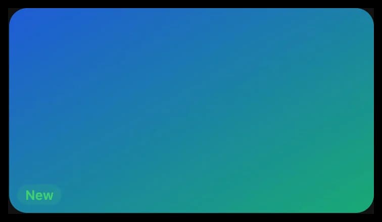
gold and ink are custom colors. For text over a photo, put an Image first.
Make a picture of a View
Give a View an id, and this.captureView() makes a PNG of it, such as a ticket to share. It draws the whole View, even the part scrolled out of sight.
<View id="ticket" variant="card" gap="small">
  <Text variant="title">Lungi ferry</Text>
  <Text>Mariama Kamara, Saturday at 9:00 AM</Text>
  <QRCode value="{{ ticketCode }}" size="160" />
</View>
<Button onClick="shareTicket">Share ticket</Button>// One of the page's actions
async shareTicket() {
const picture = await this.captureView('ticket');
await this.dash.system.share({ file: picture });
}The picture is a file object, so you can show, share, upload or save it.
- An
idtakes letters, numbers,-and_. Give eachViewon a page its own. - A new picture of a
Viewreplaces the last one, and older file objects of thatViewshow the new picture. Save a picture to keep it. - An
Imagein theViewmust load within 15 seconds. If it comes from another site, that site's server must allow CORS.
captureView rejects if the page has no such View, if the View isn't showing or is too big, or if an Image won't load. The error says what to fix.