

Products · Components
Button
A button the person taps to do something.
Use variant="primary" for the page's main action and secondary for the rest. outline and ghost are quieter still.
Children: Text, which can include Text, Link and Icon within a line
Example

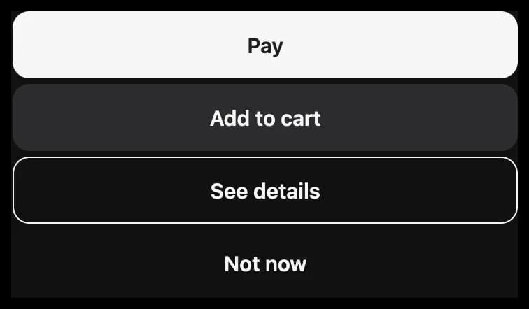
<View gap="small">
  <Button onClick="pay" loading="{{ paying }}">Pay</Button>
  <Button variant="secondary">Add to cart</Button>
  <Button variant="outline">See details</Button>
  <Button variant="ghost">Not now</Button>
</View>export default definePage({
initialState: { paying: false },
mutations: {
pay: () => ({ paying: true }),
},
});Props
| Prop | Type | What it is |
|---|---|---|
variant | primary, secondary, outline, ghost | secondary is a quiet fill, outline only an outline, and ghost only its text. Default: primary. |
tone | status tone | Draws the button in a tone's color, such as danger for one that deletes. Default: default. |
size | size | Default: medium. |
disabled | boolean | Dims it, and the person can't use it. |
loading | boolean | Shows a spinner and ignores taps, such as while a payment is sent. |
Events
| Event | Sends | Notes |
|---|---|---|
onClick | Nothing |