

Products · Components
Input
A one-line field for text, numbers, a phone number or a search.
Give it a label: a placeholder disappears once the person types.
Children: Nothing
Example

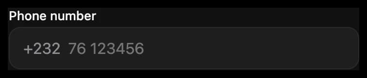
<Input label="Phone number" type="phone" prefix="+232" placeholder="76 123456" value="{{ phone }}" onChange="setPhone" />export default definePage({
initialState: { phone: '' },
mutations: {
setPhone: (_state, event: ValueEvent) => ({ phone: event.detail.value }),
},
});Props
| Prop | Type | What it is |
|---|---|---|
value | string | |
placeholder | string | |
label | string | |
hint | string | Help shown under the field, which error replaces. |
error | string | Shown under the field in red, in place of hint. |
prefix | string | Text inside the field before what the person types, such as +232. |
suffix | string | Text inside the field after what the person types, such as kg. |
type | text, number, email, phone, password, search | search shows a search icon and a search key on the keyboard. Default: text. |
clearable | boolean | Shows a button that empties the field once it has text. |
maxLength | number | |
disabled | boolean | Dims it, and the person can't use it. |
Events
| Event | Sends | Notes |
|---|---|---|
onChange | { value } in detail | |
onSubmit | { value } in detail | When the person presses the keyboard's submit key. |